A Brand New Look
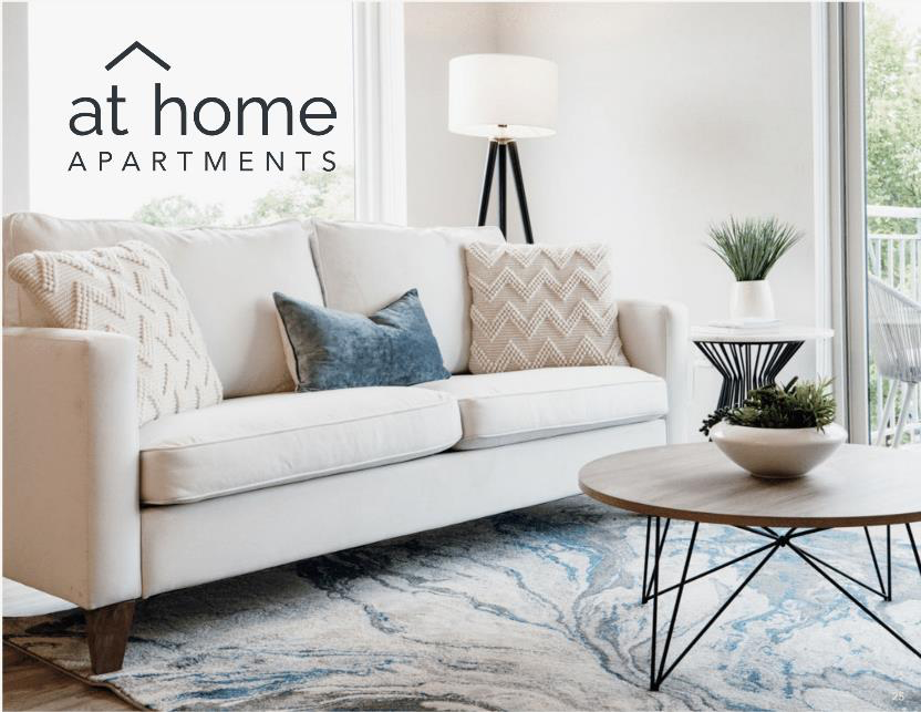
You may have noticed something different about At Home Apartments lately. In 2021, our team embarked on a process of identifying what defines At Home Apartments. A refreshed brand with an updated logo, color palette, and tagline resulted.
Tagline: Find Your Place
The core of our brand update was the creation of a new tagline: Find Your Place. As we discussed the heart of our brand, common themes began to emerge: belonging, comfort, hospitality, and home. We feel this phrase encompasses much of what we value as a company. At Home Apartments is where our residents can find their homes, where employees can find purpose, and all can be part of the larger communities. It’s a call to action and a call of welcome. It’s not about being someplace; it’s about being in your place.
Logo
We kept our logo largely the same with some key updates. We “raised the roof,” so to speak, to show the diversity in our homes and removed the window in between the t and h. We wanted to remove any implied barriers in our logo and create an open feel that reflects our commitment to hospitality. We also added two new additional logo options, one that includes our tagline and another “bug” logo that works on a smaller scale.
Color Palette
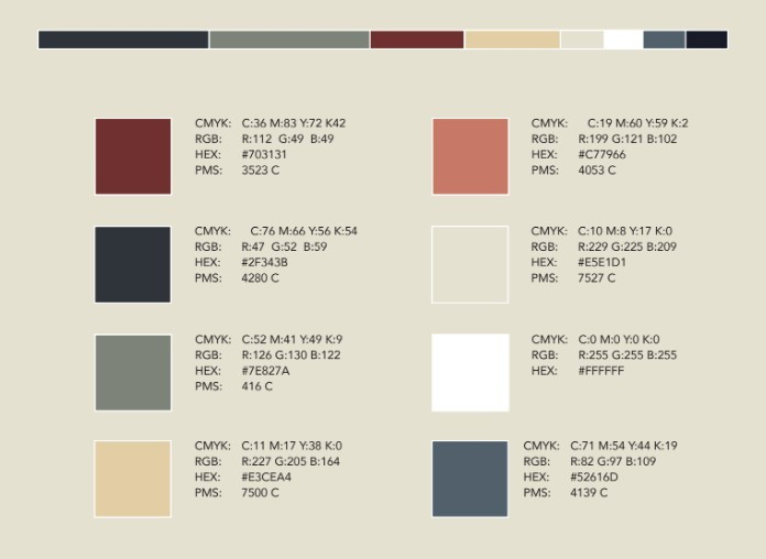
Not only did our logos get a little makeover, but so did our color palette got an update. Our new colors keep red and blue with a sophisticated update and added some new contrasting colors. Our goal was to create a mood that conveys warmth and comfort, while the additional colors provide flexibility in how we display the brand.

With our updated brand our team is ready to take on 2022!